
 Go Back
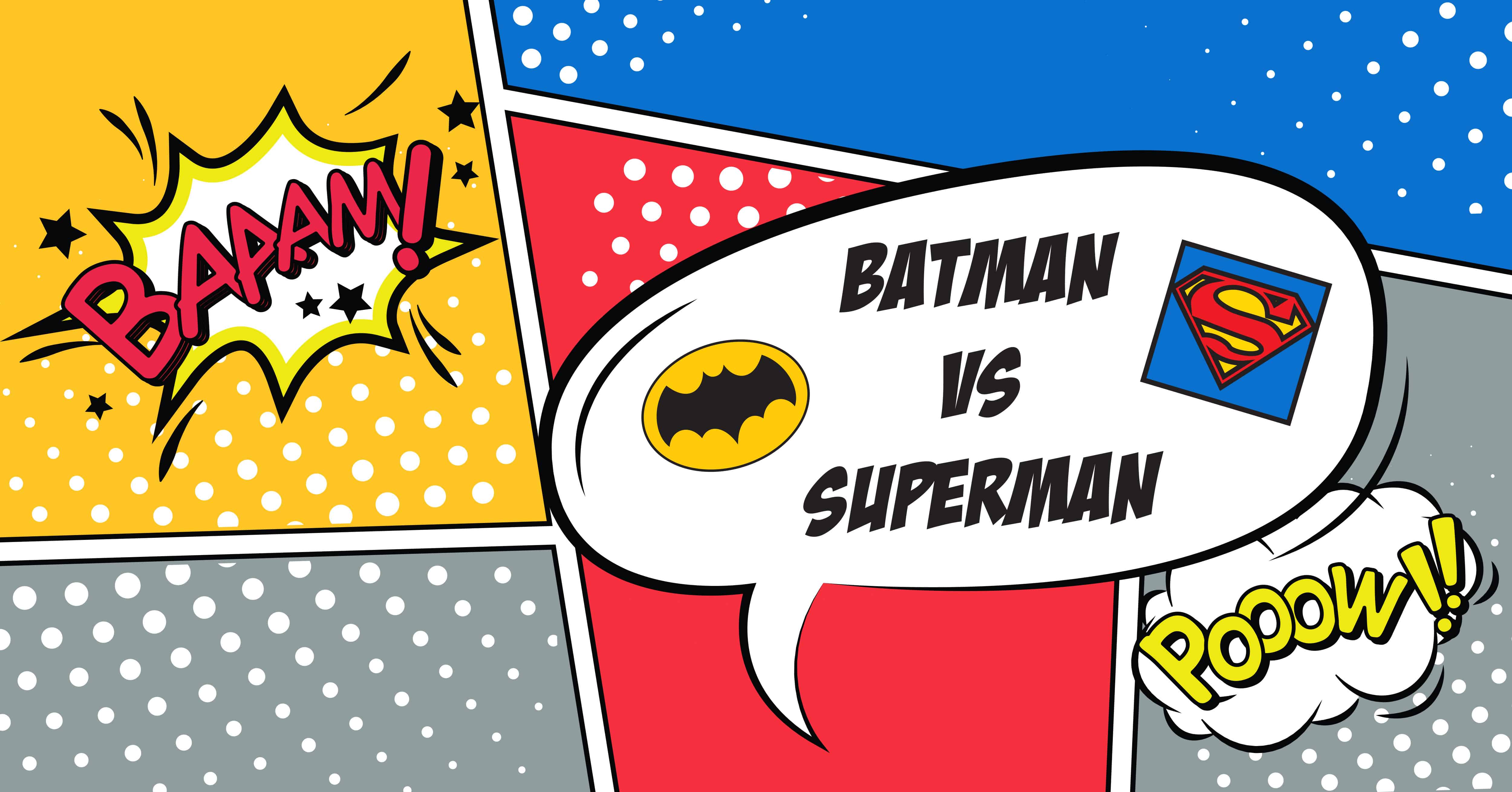
Batman vs Superman

To highlight the recent Batman vs Superman premier we decided to compare the two admired characters by identifying their pantone colors. Pantone is a set of standard colors used for printing, each of which is specified by a single number. Designers frequently use Pantone colors when designing a brand to maintain the identity of the company across all different mediums.
The illustrators that created the Batman and Superman characters used the same method so that each hero could not only be identified by their unique costumes, but also their color schemes. I found an old DC Comics Pantone guide from 1982 via www.creativemarket.com and was able to pull out the original pantone colors used for Batman and Superman:
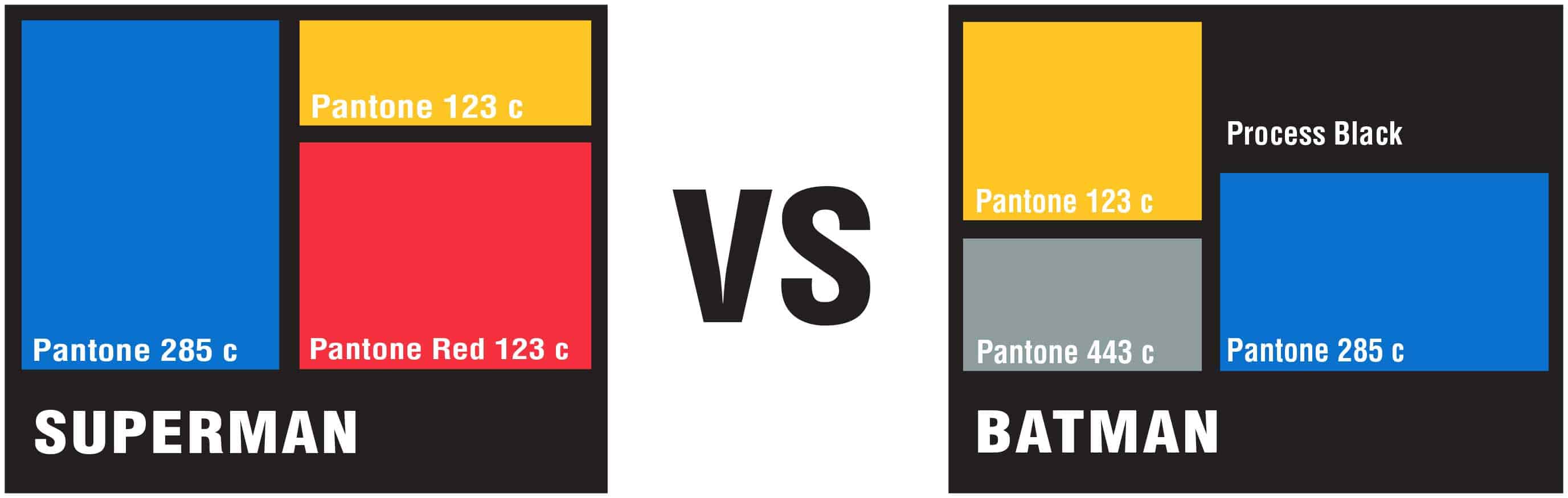
Similar to branding in the marketing and design world, color is an important storytelling tool in the comic world. You’ll find that every comic publisher has its own style of drawing and coloring but they still follow the color rules in general. This shows the importance of color theory to each character and their brand. Both Batman and Superman were first published in the 1930s, and although both were considered heroes, they did not share the same perspective of the world. The colors used for each character highlights this difference:
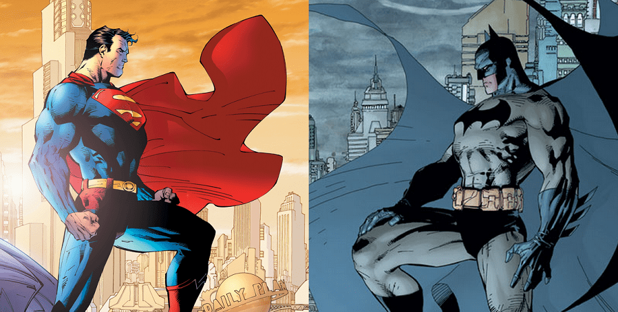
Image provided by comicvine.gamespot.com
Batman’s character is a vigilante with no actual superpowers. His iconic suit was made to mimic the look of a bat in the night sky. Unlike other Super Heroes, Batman wanted to use the power of fear to overcome his enemies, which is a tactic typically used by villains. Over the years, black, grey, and blue make up the majority of his suit and give the illusion that he is a “creature of the night.” Older Batman characters had glimpses of a vibrant yellow and bright blue alluding to a more heroic side of the character. Changing technology also had an effect on the color of the character. Years ago comics favored the sparing use of black ink, so blue was used to create the impression of the night sky. When the TV series was introduced, darker colors were used because they created more contrast on screen. Here is a diagram of Batman’s changing costume over the years:
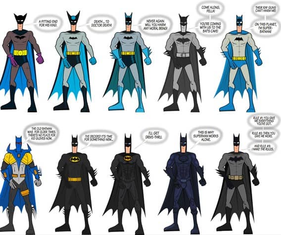
Image provided by comicsalliance.com
Superman has actual superpowers and is widely popular with the general public. He wears a bright blue, red and yellow suit, which are the ultimate superhero colors. They are thought to be uplifting and dutiful colors. These colors have generally stayed the same throughout Superman’s existence in the comic, and now digital world:
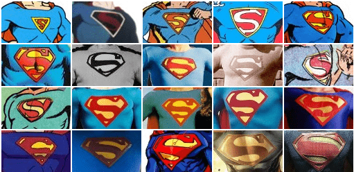
Image provided by www.supermanhomepage.com
Everyone subconsciously creates a judgment of a character based on the colors of their suit. In conclusion, it is clear that the dark shades have been effectively used to show off the resentful and weaker state of the mortal Batman, and that more vibrant primary colors are used to show the power and endurance of the esteemed Superman character.
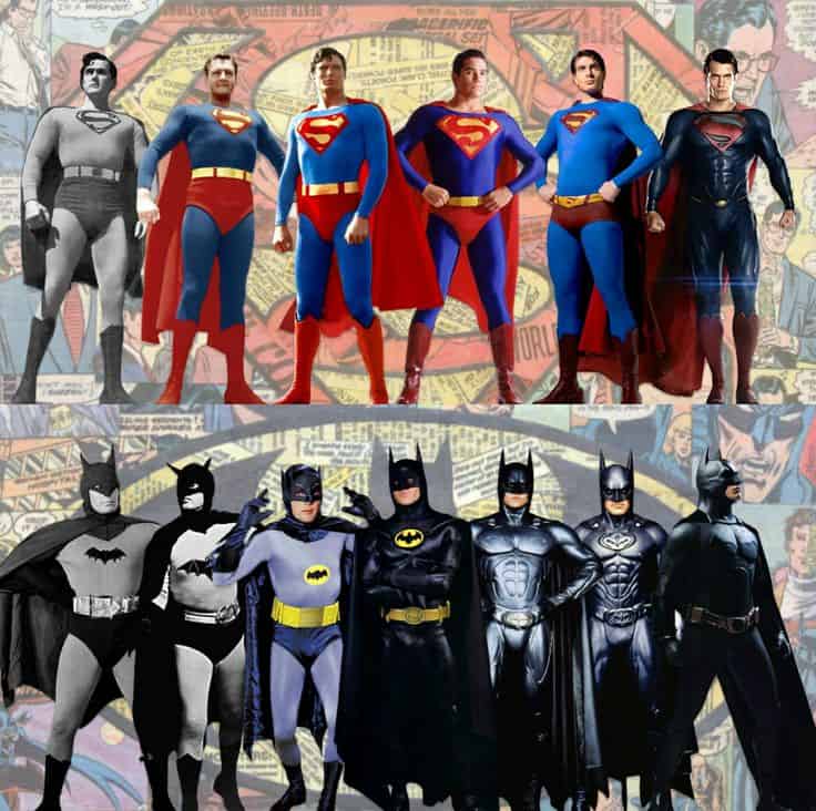
Image provided by www.pinterest.com
In the marketing and design world, color is a key component in creating the brands for various companies. Color can tell a story before even getting to know a brand. It can also influence the decisions that you make or the decisions you don’t make when choosing a product or service. Warm colors (red, yellow, orange) are generally energizing, passionate, and positive. While cool colors (green, blue, purple) are generally calming, relaxing and somewhat reserved. A good color choice for a design can be just enough to add that next level of greatness to a brand.
While Superman and Batman’s logos are an important asset to their characters, it is the colors that truly reflect the men -mortal or immortal- that they are on the inside.